Product

By
Rich Harvey
//
21 July 2025
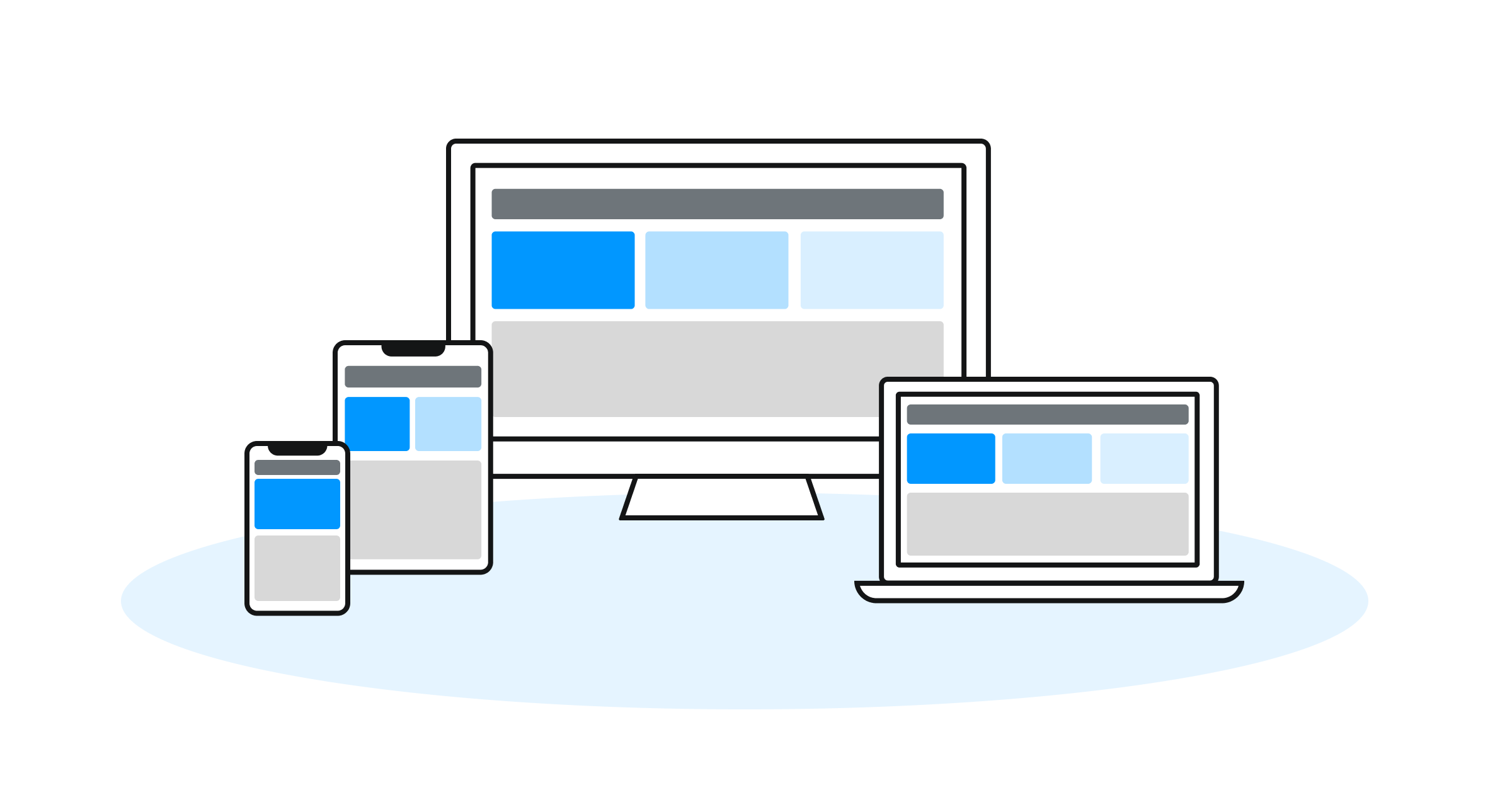
In the most recent release of Squirrel, we introduced Layout Containers. These column and row containers are designed to make building apps for different device and screen sizes easier. Over on the community site, Isaac has run a series of webinars showing how to use Layout Containers to build cool menus and navigation bars.
The flexibility and creative potential of Layout Containers is incredible, but it’s also sparked some debate within the Squirrel team. How should we describe the UI built with them? Is it responsive, adaptive, or something else entirely?
A quick search online gives you the following definition for responsive layouts:
A responsive layout is a fluid design approach that automatically adjusts the size, position, and arrangement of content to fit any screen size or device. It uses flexible grids, percentages, and CSS media queries to ensure that the layout adapts smoothly across desktops, tablets, and smartphones—without the need for multiple versions of the same design.
It’s good, but it’s not a perfect fit for Layout Containers. Mel, our Chief Experience Officer, describes them as giving Squirrel “elements of responsive like behaviour”. Our vision is to provide more responsive capabilities. However, the current pixel-based size and placement of components makes a true responsive capability difficult.
Whilst true responsive capabilities are currently a challenge, an adaptive layout is entirely possible and is something we’ve been experimenting with.
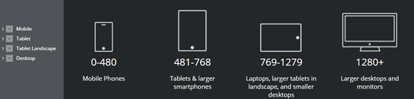
An adaptive layout uses predefined, fixed layouts tailored for specific screen sizes or device types. The website detects the user’s screen dimensions and loads the most appropriate layout version—such as a separate layout for mobile, tablet, or desktop—resulting in a more controlled but less fluid user experience.
Our first experiment was to build different Squirrel projects, one for each device size, e.g. a mobile version, a tablet version and a desktop version. Then at runtime detect the browser size and load up the correct project.
This worked well however had some limitations:
We started thinking, is there a way we can have an adaptive layout without splitting it across multiple projects? Now that we’ve introduced lazy loading, we have greater scope of adding these layouts into a single project, without causing performance issues.
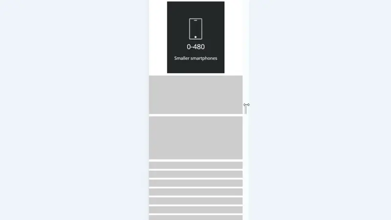
For our next experiment, we created multiple UI layouts in individual canvases
Then using the window size add-on we can determine which UI to dynamic display.
This has worked amazingly well, and has given us some great capabilities:
We’re still refining this approach, but the early results are promising. By combining the power of Layout Containers with clever project structuring and runtime logic, we’re edging closer to delivering genuinely adaptive, and perhaps even responsive, Squirrel apps.
There’s still plenty of work to do, but we’re excited about where this is heading. If you’ve been experimenting with Layout Containers or building adaptive UIs in Squirrel, we’d love to hear what you’ve tried, what’s worked, and what challenges you’ve faced. Join the conversation on the community site and help shape what comes next.
GET STARTED
Sign up, get building, and pay when you’re ready to launch.